The definition of graphic design, when you ask Google, is “the art or skill of combining text and pictures in advertisements, magazines, or books.”
According to Merriam Webster the definition is “: the art or profession of using design elements (such as typography and images) to convey information or create an effect”
AIGA (the American Institute of Graphic Arts) defines graphic design as “the art and practice of planning and projecting ideas and experiences with visual and textual content”
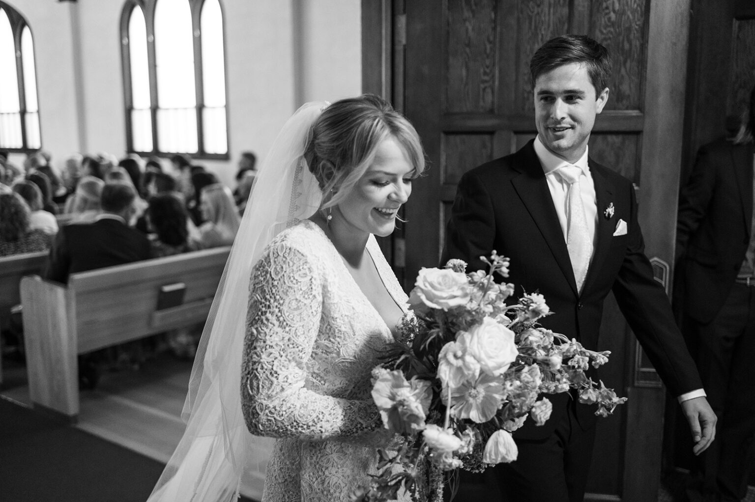
There are many more definitions, but when you read them all, you’ll notice a pattern. The repetition of these two elements; text and image. Text and pictures. Typography and images. Visual and textual context. The simplest way to describe design is to say you’re a master at combining text and image to create effective visual communication.

My creative journey, beyond childhood crafts and a love of books, started with the camera. I learned the basics of photography (shutter speed, aperture, ISO and etc…) when I was really young. From photography grew a love for composition. Snapping a photo with leading lines, depth of field, utilizing the rule of thirds..it was all so exciting, and still is.

In design school, my favorite classes focused on typography, or styling text. From a love of composing a photo grew a love for composing text. And then intertwining thoughtful images within that text. And there you have it, I was designing. This full-circle exploration of creativity makes complete sense when learning the simple definition of graphic design. Text, and image.
WHY DOES THIS MATTER?
Why is it important to understand this definition of graphic design? This depends on who you are, and what you’re looking for as you create your next piece of communication. As a designer, you think more clearly about the parts and pieces you need to create something visually impactful. As a marketing professional, you know you’ll need to supply your designer with great images for that brochure you’re hiring them to do, or ask them to source or create images for you.
As an art director, you can create moodboards with photos that elicit feelings that capture the brand voice of whatever organization or product you’re planning for. As a photographer, you can plan a shoot based on the understanding that you’ll need images with whitespace (or open space) for text to be applied, or website navigation to sit if it will live on a computer or phone screen.
No matter who you are, you can benefit from understanding the power of a great image, and the necessity of applying text to (or next to, or near it), to convey your message.
YOU CAN’T HAVE ONE WITHOUT THE OTHER…
A great example of a design project that can rely heavily on great photography is website design. If you need a refreshed, updated website for your organization, and you’re imagining photos of your team, your products, or your office space, you’ll need to schedule a shoot with a photographer who understands your vision, and understands where these images will end up. It’s a lot harder to refresh your website in a way that feels authentic to you, without first creating those authentic images.
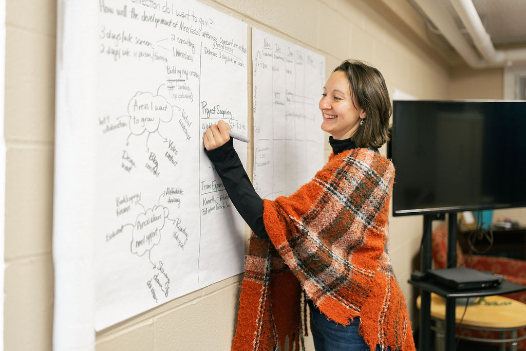
The next time you work with a designer, keep the definition of design in mind, and plan for them to ask if you have any images on-hand already, or if you would like them to source stock photos, hire a photographer, or take photos for you!
Check out some of my photography work here, and think of me before you ask your marketing department to create a new-hire advertisement without updated workplace photos!

