

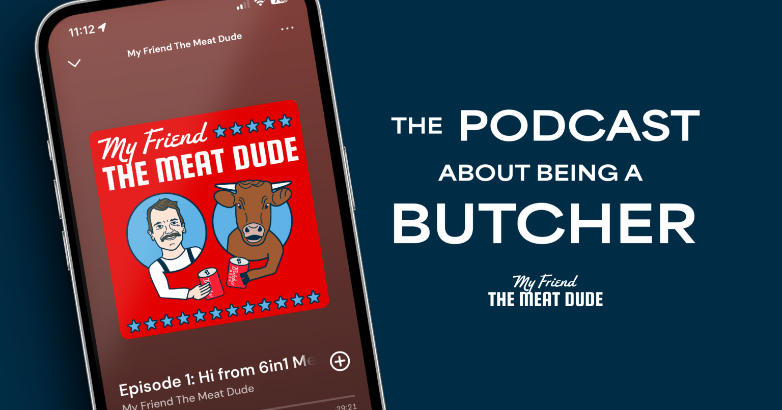
My Friend the Meat Dude Podcast Design
CLIENT My Friend the Meat Dude Podcast Cover Design Logo & Branding Naming Consultation ABOUT
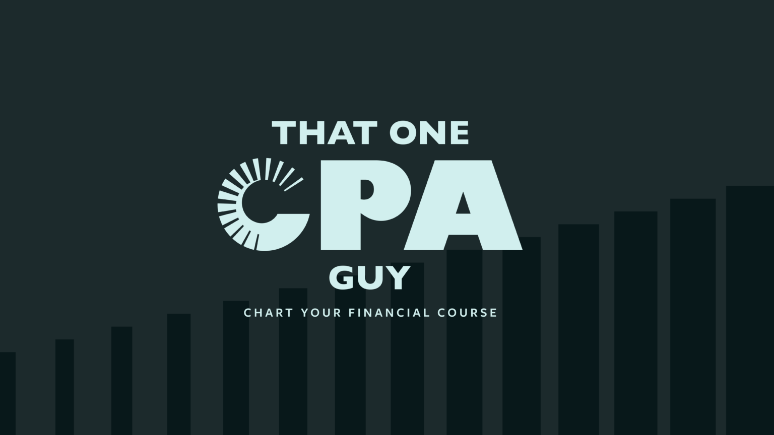
That One CPA Guy
CLIENT That One CPA Guy Logo & Brand Development Website Design & Build ABOUT Clark
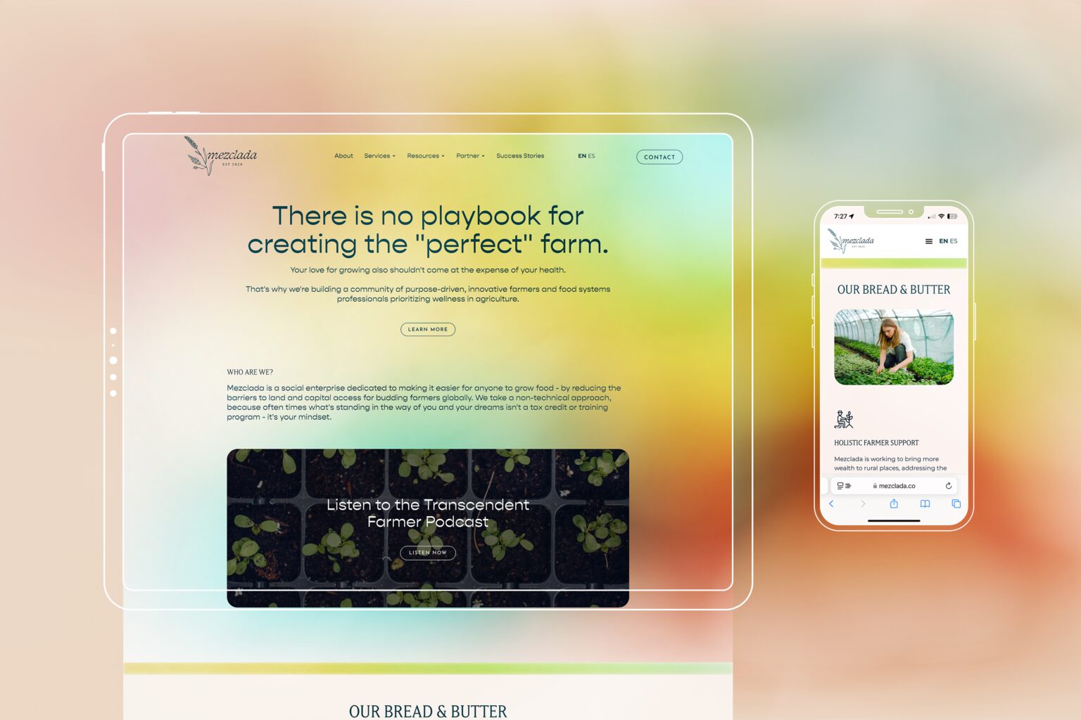
mezclada.co
CLIENT Mezclada Web Design WordPress Development Brand/Design System ABOUT Mezclada is a social enterprise dedicated