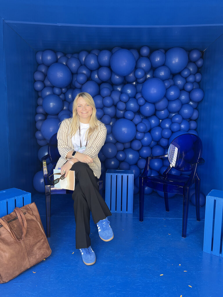
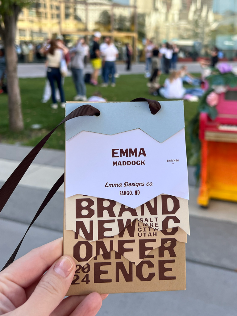
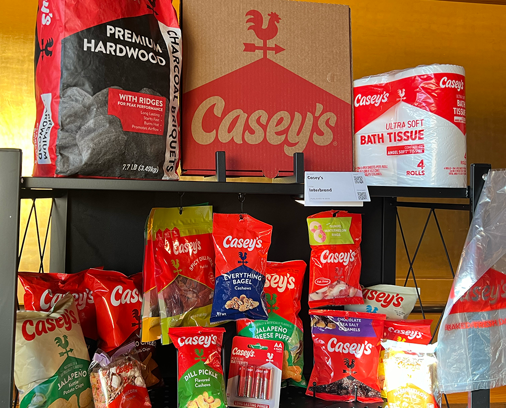
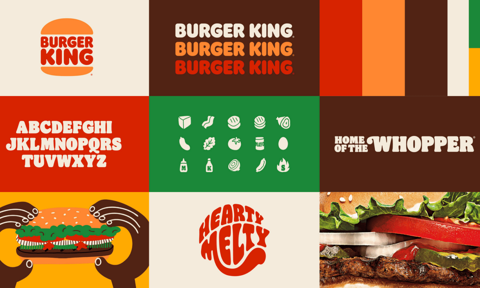
The other week I went to the 2024 Brand New Conference in Salt Lake City. Going to a conference with a couple-hundred design nerds who love type and branding as much as I do was an amazing experience. I’ve followed Brand New since college, and it’s a great resource if you’re at all interested in the world of graphic design and branding.
At the conference, we heard from many inspiring designers, creatives, professors, and business people who understand the importance of design when it comes to making each of their respective organizations succeed. Here are a couple of takeaways I’d like to share:
“Design is used for marketing. And marketing sucks. Design doesn’t suck per se, but it also helps a thing that sucks so that sucks.”
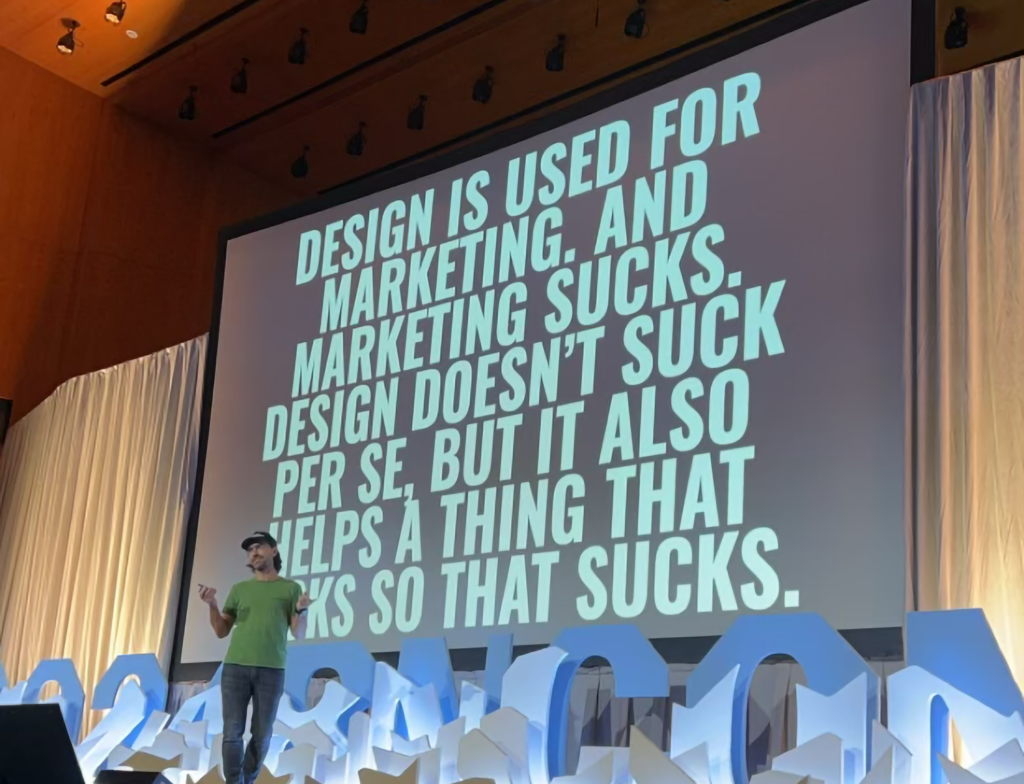
I felt this deep in my soul. (Even though I sold said soul to the Liquid Death Reaper when I cracked open my first can of crisp Liquid Death water a few years back.)The amount of time I’ve spent going back and forth between wanting to be called a designer, and being called a “communications professional” or a straight up “marketing specialist” has been painful! But the whole idea is that as a creative person with design skills, I’m helping the marketing train chug along. Because when I make something beautiful, it’s used to market something that will help sell it. I quite literally can’t say I’m “ONLY A DESIGNER” because in reality, my design work is used for marketing every single day. (Please don’t think my content marketing skills apply to setting up your quarterly ad-spend on google and meta, though…that’s another story for another blog!)
“Build a system that grows with the organization”
-Cat How, How&How
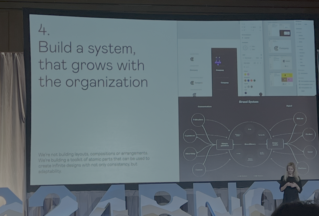
This relates so perfectly with another thing Andy from Liquid Death said: “A brand guide is the death of a brand”, as well as something Dhiya Choudary from Magic Spoon said: “Breaking the brand can mean you’re expanding the brand”. If you’re working on a brand guide with the idea that the rules outlined within those pages can never be broken, and never be stretched or added on to, then your brand can only get so big. Your organization can only grow so much if the first version of the brand guide is the “end-all-be-all”. When you’re working on your company’s brand, you need to build it with the foundation that can grow as you grow.It might seem like a paradox, and maybe it is. You’re told you must follow brand guidelines, and I believe you should, but you should also be pushing your brand to new places with each milestone you pass. Just make sure to record your new branding endeavors and your process within that ever-evolving brand guide! This will be easiest if you have a solid foundation to add to!
“Design is about ideas, not aesthetics.”
-Max Ottignon, Ragged Edge
I’ve had a hard time explaining why I feel icky when I’ve worked in places that only consider branding “What colors should we use?!” and “Ooh that font is so cute!”… I think this quote sums up my feelings perfectly. Design is not simply why purple is complementary to yellow, and why this font pairs well with this one. Design is the deeper, more conscious decisions that go into why we as designers we choose various elements to represent the story of the organization that we are branding. When we choose a color palette, it’s not a random decision because we think it looks nice, it’s a careful decision we deliberated on knowing that the audience will associate green with money, and blue with hope. We choose a font for web that’s different for print because we know that the font on the website looks cold when printed. We reference and champion the history of the organization we’re branding when we decide to use the founder’s original mission statement in the tagline version of the new logo. We consider the tone of voice that the brand will take on, and decide whether the use of white-space and bold type successfully reflects the DIRECT, on-the-nose nature of the brand.
“You know, I’m somewhat of graphic designer myself”
-Michael Benjamin, Studio Parkside
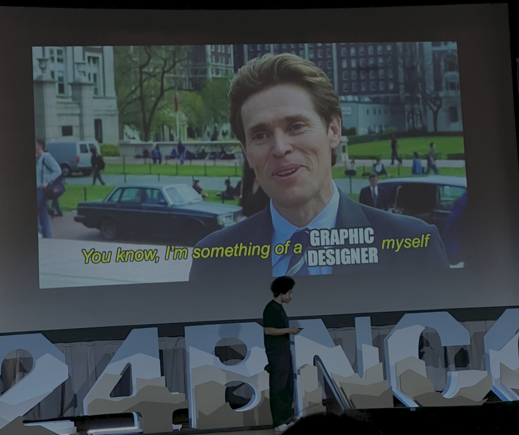
I’m just going to leave this here, because it’s funny…
Also, Michael touched on the fact that as designers, we’re all teachers. When you create things, you do so by following practices you know innately as a designer. When a client asks you to do something that might not work, it’s your job as a designer to explain why that’s a bad idea, and teach them that you didn’t go that route because of “XYZ.” Even though designers tend to be quiet, reserved individuals, we also have to be outgoing and confident teachers! Ha!
There are about a million more quotes that I could explain that resonated with me but I’ll end this with a few more photos from the conference!
